Textual Analysis: Music Magazine (Billboard)
Denotation:
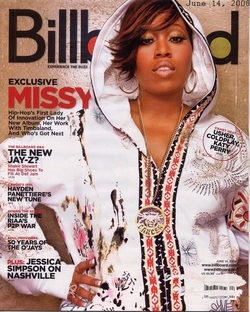
This magazine cover is of a woman; her body is facing forward
looking straight into the camera with her hand on her hip, this is a medium
shot. The background is of a gold/brown colour; all the cover lines are written
in black whilst the important words are in red. A bar code is visible on the
lower right hand corner of the page.
Masthead:
The ‘Billboard’ masthead is written in a sans serif font it is
simple. What can be seen of the ‘B’ and ‘D’ from the word‘board’ are coloured in
with red and green giving it a fun feel. The masthead for ‘Billboard’ reminds me
of the no longer running but once popular TV show‘Top of the pops’ this is
because the font for ‘Top of the pops’ was in sans serif like the one used in
‘Billboard’ and all of the letters that had the loops like the ‘B’ on
‘Billboard’ were coloured in, in a range of coloures. The two can easily be
compared as they both focused on music but not just one genre of music but a
range, covering a range of artists. This could explain why the red and green are
used for this mastheads colours, to expand on this point the colour red connotes
passion, love and desire whilst green can connote nature and a certain aspect of
freshness. This magazine does not focus on just one genre of music and this can
be clearly seen through the range of cover lines showing features on many
different artists known across a wide range of genres. The colours that was used
in the masthead reflects this point as they clearly show examples of different
colours which have different feelings and emotions attached to them, just like
the range of music that is featured.
Character:
The Cover photograph is an image of the successful female American rapper known as
‘Missy Elliot‘.
Composition:
Missy Elliot is posed in a very direct manor, one hand is placed
on her hip and her head slightly tilted up towards the side although this does
not stop her from looking directly into the camera. This stance gives off a very
ghetto and protective look.
Costume:
Missy Elliot in this shot is wearing a large gold hooded jumper
with the hood pulled up; the jumper itself is a very clean fresh white but has
designs in gold, black and red in places. She is wearing large gold earrings, a
large, long gold chain and a gold ring on her French manicured fingers which are
placed on her hip. Her hair is short that flicks out with streaks of red, whilst
her makeup is quite plain and natural until you reach her eye, her eyelids have
a light gold eye shadow and long fluttering unnatural
lashes.
NVC:
The non verbal communication shows a young woman that is very outgoing, who clearly
has an attitude that her body language instantly makes you aware of the hands
on the hip and the slight tilt to her head gives her a very strong loud
look.
Lighting:
The lighting in this shoot is very bright and clean connoting; giving the subject a
flawless effect and shinning against the gold in her jewellery and clothing
appear brighter.
Setting:
The setting for this shoot is a plain gold background giving a clear connotation
of wealth and superiority.
Cover-Lines:
The main cover line is in relation to the artist on the front
being ‘Missy Elliot’ it comments on her upcoming album, collaboration with the
known hip hop artist ‘Timbaland’ and her current work that she is doing. She is
called the ‘”First Lade of Innovation” this is referral to her well known rapper
status that has bought her up to being the best, this is through her work in the
90’s and early 2000’s, The main cover line focuses on hip hop music. The minor
cover lines however focus on a range of artists known from a ranger of genre’s
it mentions alternative artists such as‘Ashley Simpson’, pop artists such as
‘Katy Perry’ and R’N’B artists like‘Usher’, this confirms that this magazine
focuses on a range of artists and covers every bodies musical
tastes.
Textual Analysis: Music Magazine (Vibe)
Denotation:
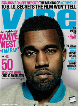
This magazine cover features a colour photograph of a male whose head is very
slightly tilted to the side as he looks directly into the camera; this is a
close up shot. There is a white/ grey background behind him. The main cover line
and important features are in a hot pink colour whilst the minor cover lines and
masthead are in turquoise the descriptions following the cover lines are in
black.
Masthead:
The ‘Vibe’ masthead is very simplistic; its written in a sans
serif font and give off a very modern feel, but also the turquoise colour that
was used for the masthead gives it a young feel, like its aim is to attract
young people or it suggests it’s a magazine for young
people.
Character:
The Cover photograph is of the successful American rapper ‘Kanye
West’.
Composition:
Kanye West is looking directly into the camera, his head slightly tilted to the side.
He has a straight almost stern expression.
Costume:
This shot is a close up shot so it’s hard to distinguish any
costume that is being worn, of what can be seen it’s clear that Kanye is wearing
a varsity jacket of some kind. Kanye appears well groomed as his hair is shaped
up and obviously brushed and although he has facial hair growing it is clearly
styled and meant to grow in this way.
NVC:
The non verbal communication exhibited by Kanye West shows a very serious man, he
is not showing any emotions in his facial expression but the slight tilt of his
head suggests a possible soft side.
Lighting:
The lighting in this shoot is very bright giving the subject an almost gritty look
as it directly on the subject.
Setting:
The setting for this shoot a white/grey background its very plain as if not to
take any attention from Kanye West that’s being photographed, the colours that
are in the background connotes the purity and goodness of white but also the
sadness and confusion of grey which could relate to photo as Kanye West looks
sad and confused but his slight head tilt suggest a hidden
goodness.
Cover-Lines:
The main cover line is in relation to Kanye West’s success quoting his claim ‘I am
Rap’, the article is about Kanye’s top 50 tracks and his 10 worst tracks, it’s
clearly focused on Kanye’s music which genre falls into hip hop. The magazine
has minor cover lines focus on other hip hop / pop artists such as ‘The Dream’
and ‘Brittney Spears’ however they hold no information on what their features
are about unlike Kanye West’s.
Target Audience:
The target audience for this magazine would most likely range from people in their
early teens to early twenties who are interested in hip/hop, pop and rap music.
The colours used for this cover make this a highly probable target audience
simple because they are very bright colours that young people are more attracted
to.
Textual Analysis: Music Magazine (Vibe)
Denotation:
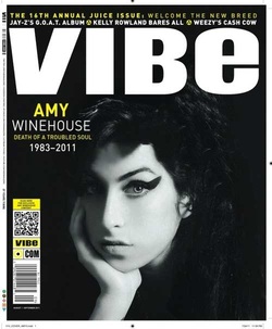
The magazine cover features a black and white photograph of a single female, looking
into the camera, her face at a slight angle; it is a close up shot. Her chin is
resting in her hand and her face is slightly angled but her gaze is directly
looking into the camera. The background of this photograph is in black whilst
the main cover line and the minor cover lines are in white and important words
are in yellow. A scan code and bar code are found on the lower left hand corner
of the page.
Masthead:
The ‘Vibe’ masthead is written in a sans serif font, it is very simple as it
consists of large, bold and upper case letters. This gives the masthead a clear
modern look, also the colour used for the masthead which is white connotes that
this magazine is honest, modern and good this is because when analyzing the
colour white one usually gains the feeling of purity, innocence and goodness but
also white gives a crisp clean feeling.
Character:
The cover photograph is of the late and successful singer Amy Winehouse.
Composition:
Amy Winehouse has taken on a very delicate pose, her face/chin gently resting in her
small hands.
Costume:
You can see very little of her clothing in this cover shot but
of what you can see it is very dark in addition to this her hair is very dark
and black as well as her dramatic eye makeup. Although the colours are very dark
you can tell her eye makeup which is heavy and flicked into a feline style and
her hair is gathered up into a beehive her style is obviously inspired by a
different era, being the similar to the popular 60’s style.
NVC:
Her non-verbal communication shows that she is depressed or sad; she is positioned
in a pose that many people result to being in when they are fed up or they have
given up. Her face is very straight and no emotion is shown ,yet her eyes seems
to say something they are piercing and clear with if looking carefully suggest
she has a certain beauty about her and possible hope that her body language
does not let on.
Lighting:
The Lighting for this image is very dark it only seems to be focused on Amy
Winehouse’s face, illuminating it and giving it a flawless
finish.
Setting:
The Setting for this shoot has a black background it does not connote goodness or
love or anything of the sort but instead reminds one of death, secrets and
depression.
Cover-Lines:
The main cover line is in relation to the woman photographed
unfortunately it does not mention anything good about her achievements or
success but instead says ‘Amy Winehouse Death of a troubled soul 1983 – 2011‘.
This cover line is advertising its feature on the singer’s death. It is a well
known fact amongst those that new of Amy Winehouse that she was troubled,
struggled against drug and alcohol abuse for years and sang of very depressing
things. This magazine concentrates on Amy Winehouse but what is different is
that this singer wasn’t an R’N’B artist or a hip hop artist but she sang Jazz,
this is not what the magazine usually focuses on you can tell this because the
minor cover lines mention well known artists such as Jay Z and his new album, a
story on Kelly Rowland and something strange about Lil’Wayne (Weezy) all the
artists that feature in this magazine other than Amy Winehouse are well known
for being in the Hip Hop and R’N’B
scene.
Target Audience:
Looking my points previously written I would say that this magazine itself it targeted
at a young audience ranging from people in their late teens to mid twenties this
is because they are mentioning well known artists in the popular R’N’B music
scene in the minor cover lines. Although this is a valid point it is clear the
magazine didn’t waste any time by covering Amy Winehouse’s death that many
people would be interested in as she was widely listened to by many ages, older
people who were into jazz and younger people who understood and related to her
songs of heart break and young love.
Textual Analysis: Music Magazine (XXL)
Denotation:
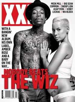
This magazine cover features a black and white photograph of two
people. It’s a medium/ long shot. The male is looking directly into the camera
with his arm around the female whose body is sideways facing the said male, her
hand placed on his chest in, whilst her neck and is turned so she can directly
look into the camera. The female is clearly pregnant and the male is heavily
tattooed. This image has a clear white background whilst the magazine masthead,
main cover line and the slashes that separate the cover lines are in red, the
minor separate cover lines are in a black bold font, a bar code is visible
underneath the main cover line in the left hand corner.
Masthead:
The ‘XXL’ masthead is very simplistic; this is because it is
just a red rectangle with white words inside that say ‘XXL’ in very large bold
letters, the font that is used is a sans serif font that appears to be very
modern, clean and direct to the point. The font used in the masthead of this magazine reminds me of the new
underground, yet up and coming clothing brand ‘Obey‘ that is currently worn by
many young teenagers that are into underground and hip hop music, it’s easy to
connect the two as ‘XXL‘ also focuses on the same musical genre. I found that
the connotation for the white font on the red background for this particular
masthead could be the contradicting feelings and emotions that come with fame,
the passion and desire to have power but also the conflicting want or need to be
pure and good on your way up, this is because red is most commonly associated
with power, passion, desire and love whilst white is associated with purity and
goodness.
Character:
The Cover photograph is of the successful American rapper Wiz Khalifa and his
socialite/ model fiancée Amber Rose.
Composition:
The couple is posed in a very loving, protective embrace, the male’s hand is firmly
around the females waist as his body from the left slightly leans forward, the
female is facing sideways clearly to show off her baby bump, her hand is
protectively on his chest and her body is leaning into his.
Costume:
Amber Rose in this shot is wearing all white, a white tight tank
top that is pulled up just above her bump and a small pair of underwear that is
just below her bump, this outfit shows off both her pregnancy but also her
tattoo that is on her lower stomach. She is wearing a single piece of jewellery
on her wedding finger this is on the hand that is neatly placed on Wiz Khalifa’s
chest. Her hair is very neat, her makeup well done and her skin giving off a
glowing effect. Wiz Khalifa is wearing a black hat, no t-shirt, white boxers
that can be seen over the top of his dark jeans, he is covered in tattoo’s that
may symbolize his tattoos are his clothes and his identity that is all he has to
wear to feel comfortable, but he is also wearing subtle jewellery a chain, watch
and diamond earrings very slyly showing off his wealth yet keeping it
simple.
NVC:
Their non verbal communication shows a very loving protective relationship, his body
language clearly shows he both proud and protective of her, her body language
mirroring this also. The couple is clearly drawn to each other as they lean
into each other very subtly.
Lighting:
The lighting in this shoot is very bright and clean connoting almost innocence and
purity but also an almost raw and blank affect like it aims to make the perfect
look perfect but if an imperfection is in existence the light will not conceal
it.
Setting:
The setting for this shoot is a white background that again keeps with the
common connotation for white this is a symbol purity, goodness and innocence
you can easily connect this with the couple as love pure, good and innocent.
Cover-Lines:
The main cover line is in relation to the couple pictured on the front it says “With
a banging new album, his own label, Amber Rose and a baby on the way… No Body
Beats Wiz” this cover line suggests that the featured article doesn’t just focus
on Wiz Khalifa’s musical success but his success as a person, his beautiful
fiancée and his unborn child. The minor cover lines mention artists that are
into the same genre of music as Wiz Khalifa’s and some who have in fact worked
with him featuring on tracks and movies or vice versa, the cover lines are not
followed by a short feature of what to expect like Wiz Khalifa’s just their
names, this suggests that this magazine is focused on Wiz Khalifa’s success and
that is the selling point.
Target Audience:
The target audience for this magazine would be hard to pinpoint ranging from
teenager in their late teens to young adults in their late 20’s this is because
the artist and artists that are featured in this magazine, having knowledge of
the artists who were once underground and fairly new but have cemented and
influence onto hip hop culture, it also could be targeted at devoted fans of
said cover artist. This magazine could be target at a unisex audience the males
attracted to the wiz Khalifa’s feature and the females to Amber Rose and what
may be mentioned about her.
